
They had practically nothing. An amazing woman named Veronica Betsesai started this school in her own home, and she would sell doughnuts and do fundraisers to get supplies. After some years the Church of Jesus Christ of Latter-day Saints gave her even more supplies, but still she had no teacher manuals or real curriculums.
That's when I came. I knew the school needed curriculums. That's why I asked Handwriting Without Tears to send their curriculum to her school. They did. Check it out:
Why did I pick Handwriting Without Tears? Well, I guess that's what this post is all about.
I was pretty naive when I started homeschooling.
I thought that if I just had my child do copy work, they would magically figure out the best handwriting for them without instruction.
Then reality hit. The "osmosis handwriting" was a disaster.
It would take me a couple of years to find out that my child was dyslexic and dysgraphic, but by then my oldest had overcome his dysgraphia and was printing beautiful letters because of Handwriting Without Tears.
Handwriting Without Tears has been recommended by so many dyslexia and dysgraphic experts, I feel like it's the undisputed leader in how to teach children handwriting.
There are a few reasons I believe it's so successful. Here are a few:
The Kinesthetic aspect of the Wood Pieces.
There are only four shapes of wood pieces, and your child can make every capital letter using these four shapes ("J" and "U" are a bit of a stretch though...) The child can hold the pieces, they are 3D, and they are manipulative.

I believe many children need this hands-on experience to truly explore the letters in how they look and function.
The "Smiley" in the Box
Particularly with the capital letters, Handwriting Without Tears puts each letter into a rectangular box. When working with the wood pieces, the rectangle is a mat, when working with the chalk boards, it's the chalk board's frame, and when working on paper, they have rectangles on the copy word pages when introducing the letters.

But most importantly, in each rectangle, in the left upper corner, there is a smiley. On the paperwork the smiley becomes a dot, but the child knows it represents the smiley.

This is INCREDIBLY IMPORTANT. Dysgraphic children have no sense of right or left, or how to arrange their letters, but they are usually great visualizers of space and shape.
It might be near to impossible to remember what an "N" looks like on its own, but they can remember the rectangle and where the smiley is and how that "N" is oriented to the smiley and thus be able to correctly write an "N."

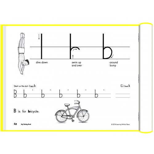
Pen strokes are put into easy categories.
Handwriting Without Tears categorizes the letters and teaches all the letters in that category before moving onto another category. This is so much better than trying to teach the letters in alphabetical order.
For example, here are the capital letter categories:
Frog jump letters (letters where you start at the Smiley/the top, stroke down, and jump back to the top to finish the letter)- "F," "E," "D," "B," "P," "N," "M," and "R."

Start at the Smiley letters-"W," "U,""H," "K," "L," "Z," "X," "Y," and "V."
Start in the middle letters-"T," "I," "A," and "J."
Magic C letters which can all be made by doing the letter "C' first. (My kids love wearing a magic cape when learning about the magic C that can turn into different letters.)- "C," "O," "Q," "G," and "S." (The S is a tiny magic C.)
That's it! Four different categories of pen strokes can make the entire alphabet. They do this for the lower case letters as well:
Magic C letters- "c," "a," "o," "d," "s," "q,"and "g."

Dive down letters (where your pen stroke goes down and back up and then over. There's an awesome chant/song where that we listen to as we pretend to swim like the dive down letters)- "r," "p," "h," "b," "n," and "m."
Because of these categories, when a child is about to make a letter, and is obviously struggling, all you need to do is say "dive down" or "magic C" and instantly they know how to make that letter correctly.
Stories
Maybe you noticed that I left out the lower case letters "e" and "f." That's because they have stories to go along with the creation of these letters.
The "e" is someone hitting the ball straight out, then circling around the bases. There's a picture to go along with the story that my kids never forget.

The "f" is a fireman spraying water from its hose as in arcs to the ground.
Those visual images make it easy for the kids to remember how to make those letters. There's other stories as well to help kids make uniform letters.
The Two Line Guides
I've seen many different approaches in how lines are drawn on a page to encourage children to make uniform letters. Some have the classic dotted Line in the middle of two solid lines, some have a line below all that, and I've even seen paper with 5 lines!


Handwriting without tears simplifies all this. There are only two solid lines. You may have to go above or below these lines, but the bulk of the letter remains inside the lines.
I believe this simplifies what the child is seeing and doing. It makes it clear what is expected of them. I love it.

All these reasons combine make Handwriting Without Tears a truly superior product.
I feel so blessed to have found it early on, and so blessed that This amazing company helps others in so many extraordinary ways.
No comments:
Post a Comment